Pivot Analysis Format
Pivot Analysis Format is a best report format for organizing and analyzing your business data. The report's main functionality is in its ability to summarize large amounts of information, and represent it in a cross-tabulated form. So, it is the best tool to create financial and statistical reports.
For instance, you can analyze sales during specific periods (years, quarterly intervals, months) for each customer or each product category, or you can create a report which will show the top 10 customers, by items purchased. Another example is a report that displays the most or least popular products.
You can easily reorganize the report's layout using drag-and-drop. As a result, the business data will be re-summarized according to the new layout of the column and row fields, so you can easily alter a report to display the information they need in the way they need it.
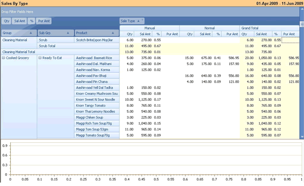
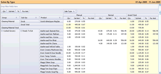
Example: Please refer to picture below as “Sales Comparison by Type”. Here, we have different inventory groups from top to bottom – in rows (like Bath Soap, Body Care, etc.) and Sales Type from left to right – in columns (like Complimentary, Normal, etc.) Data columns are Quantity Sold, Sales Value, % to Total Sales and Purchase Value.
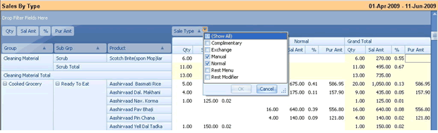
Click on Column Header name to display a drop down menu. You can choose columns from the available list of columns.
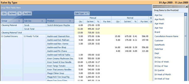
Further, you can right click on Data area and choose Field List. You can drag and drop fields to data area. Currently we have four data fields (Quantity Sold, Sales Value, % to Total Sales and Purchase Value)
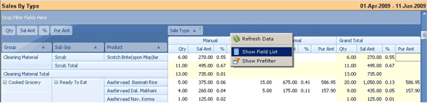
You may add more data fields by dragging it from field list and dropping it in Data area.
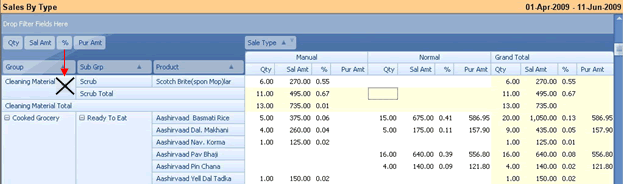
To remove a column, drag it down from its original position. Drop it when a black “X” will appear (as shown in picture below)
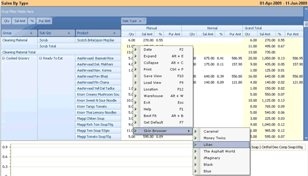
To change the report skin (background theme), right click on data area and choose “Skin Browser” and choose “Skin” like “Lilian” (as shown in picture below)
Appearance will be changed (as shown in picture below)
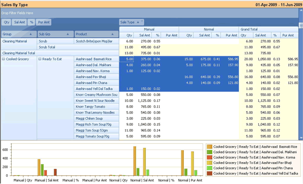
Now, let’s see the graphical analysis of this report. Drag your mouse over data area the way it is shown in picture below. I have selected data area of Manual and Normal type of Sale for six products. (Grey highlight).
This report will immediately reflect the data in chart in form of analysis pattern. Now you can compare your six products for two different types of Sale on four different data columns.

Double click on graph to open it in full screen mode.
Right click to display a drop down menu. You can change chart style, legends, angle, rotation and labels for the displayed chart.
Press “ESC” to come back to report screen
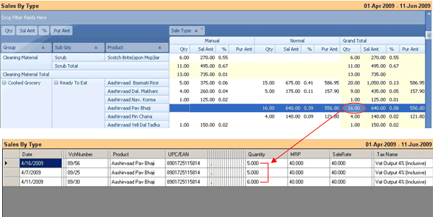
Double click any line item to see the details of it. Breakup of “Quantity” field as marked in “Grand Total” column is sum of three data rows (as displayed in picture below).